Components / Navigation
Toolbar
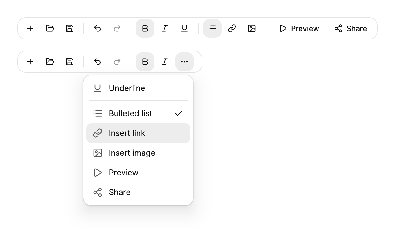
A row of small buttons, toggles and separators for an editor's most used commands.
Functions: cui_toolbar, cui_toolbar_button, cui_toolbar_separator, cui_toolbar_spacer
Usage
static bool bold;
cui_toolbar(ui, "tools") {
    if (cui_toolbar_button(ui, CUI_ICON_SAVE, .tooltip = "Save", .shortcut = "Ctrl S")) save();
    cui_toolbar_separator(ui);
    cui_toolbar_button(ui, CUI_ICON_BOLD, .tooltip = "Bold", .toggle = &bold);
    cui_toolbar_spacer(ui);
    if (cui_toolbar_button(ui, CUI_ICON_PLAY, .label = "Preview")) preview();
}
Buttons are small ghost buttons; an icon only button needs a tooltip, which is its name. A toggle flips its bool on each click and shows pressed while it is on. When the row is too narrow, items collapse from the end into a "more" menu that shows their icons, names, check marks and the separators between them. An item chosen there returns true on the next frame (the toolbar learns its width from the previous frame, so a resize settles one frame later too). Every button is in the Tab order; on the more button, Enter or Down opens the menu.
Keyboard
- Every button is in the Tab order; on the more button, Enter or Down opens the menu.
Options of cui_toolbar
| Option | Type | Default | Description |
|---|---|---|---|
.no_border | bool | Draws no border. |
Options of cui_toolbar_button
| Option | Type | Default | Description |
|---|---|---|---|
.label | const char * | text on the button (icon may be NULL); also its name in the overflow menu | |
.tooltip | const char * | the name of an icon only button | |
.shortcut | const char * | shown in the tooltip, e.g. "Ctrl B" | |
.toggle | bool * | toggle button: flipped on click, shown pressed while true | |
.disabled | bool | Greyed out, and takes no input. |
Related
- Document tabs: Closable tabs for open documents that can be dragged into a new order, as in an editor.
- Menu bar: The File, Edit, View row of a desktop app, with a menu under each title.
- Status bar: The thin bar at the bottom of a window for state, counts and background progress.
- Table of contents: A list of a page's sections that follows the reader and scrolls to a section when clicked.