Components / Navigation
Menu bar
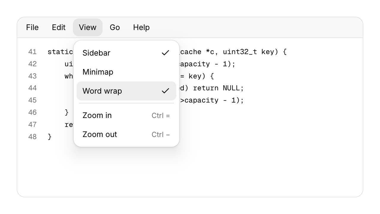
The File, Edit, View row of a desktop app, with a menu under each title.
Functions: cui_menu_bar, cui_menu_bar_menu, cui_menu_item, cui_menu_separator
Usage
cui_menu_bar(ui, "menubar") {
    cui_menu_bar_menu(ui, "File") {
        if (cui_menu_item(ui, "Open...", .shortcut = "Ctrl O")) open_file();
        if (cui_menu_item(ui, "Save", .shortcut = "Ctrl S", .disabled = !dirty)) save();
        cui_menu_separator(ui);
        if (cui_menu_item(ui, "Close window", .shortcut = "Ctrl Shift W")) close_window();
    }
    cui_menu_bar_menu(ui, "View") {
        if (cui_menu_item(ui, "Word wrap", .checked = wrap)) wrap = !wrap;
    }
}
Each menu holds ordinary menu items, so shortcuts, separators, labels, icons, disabled and checked items work as they do in a dropdown. A press opens a menu; while one is open, moving over another title switches to it. Alt on its own or F10 puts the keyboard on the bar and underlines each title's mnemonic (its first letter, or .mnemonic). Then Left and Right move along the bar, Enter or Down opens a menu with its first item ready, Left and Right inside a menu move to the next one, Enter chooses, and Esc steps back to the bar and then gives the keyboard back to what had it. Alt plus a mnemonic opens that menu from anywhere. Shortcuts shown in the menus are labels only: handle them in your app with cui_shortcut. A check sits after the shortcut text, so a menu reads best when its checkable items have no shortcut. Submenus are not supported.
Keyboard
- Alt on its own or F10 puts the keyboard on the bar and underlines each title's mnemonic (its first letter, or
.mnemonic). - Then Left and Right move along the bar, Enter or Down opens a menu with its first item ready, Left and Right inside a menu move to the next one, Enter chooses, and Esc steps back to the bar and then gives the keyboard back to what had it.
- Alt plus a mnemonic opens that menu from anywhere.
Options of cui_menu_bar
| Option | Type | Default | Description |
|---|---|---|---|
.no_border | bool | Draws no border. |
Options of cui_menu_bar_menu
| Option | Type | Default | Description |
|---|---|---|---|
.mnemonic | char | letter that opens the menu with Alt; 0 uses the first letter or digit of the label | |
.width | float | Width in points; 0 uses the component's own. | |
.disabled | bool | Greyed out, and takes no input. |
Options of cui_menu_item
| Option | Type | Default | Description |
|---|---|---|---|
.icon | const char * | An icon: a CUI_ICON_* constant, or a string from another icon font. | |
.shortcut | const char * | The shortcut shown beside it, as text such as "Ctrl N". | |
.danger | bool | Drawn in the danger color, for destructive actions. | |
.disabled | bool | Greyed out, and takes no input. | |
.checked | bool | a check mark at the right edge of the item |
Related
- Shortcut recorder: A field that records a key combination, for settings where people choose their own shortcuts.
- Dropdown and context menu: A menu of commands that opens from a button, or at the pointer on a right click.
- User menu: An avatar, a name and a detail line that open an account menu with a header.
- Toolbar: A row of small buttons, toggles and separators for an editor's most used commands.