Components / Actions
User menu
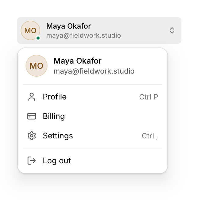
An avatar, a name and a detail line that open an account menu with a header.
Functions: cui_menu_item, cui_user_menu
Usage
cui_user_menu(ui, "Maya Okafor", .detail = "maya@fieldwork.studio", .status = "online") {
    cui_menu_item(ui, "Profile", .icon = CUI_ICON_USER);
    cui_menu_item(ui, "Log out", .icon = CUI_ICON_LOG_OUT);
}
Full width for sidebars; .compact = true shows just the avatar for headers. Options: detail, status, avatar (a texture), compact, placement, width.
The block runs only while the menu is on screen, and each cui_menu_item in it returns true on the frame it is chosen, which closes the menu. You keep no state. The menu starts with a header that repeats the avatar, the name and detail. The name is also the menu's identity and, without avatar, the source of the initials. status takes "online", "away" or "busy", and any other word gives a gray dot. The menu is 248 points wide unless width is set. It opens above the row, or below a compact avatar; placement overrides both, except that CUI_PLACE_BOTTOM_START is the zero value and counts as not set.
Keyboard
- Enter or Space on the avatar opens the menu. Up and Down move through its items, Enter chooses one, and Esc closes it.
Options of cui_menu_item
| Option | Type | Default | Description |
|---|---|---|---|
.icon | const char * | An icon: a CUI_ICON_* constant, or a string from another icon font. | |
.shortcut | const char * | The shortcut shown beside it, as text such as "Ctrl N". | |
.danger | bool | Drawn in the danger color, for destructive actions. | |
.disabled | bool | Greyed out, and takes no input. | |
.checked | bool | a check mark at the right edge of the item |
Options of cui_user_menu
| Option | Type | Default | Description |
|---|---|---|---|
.detail | const char * | second line under the name, e.g. an email address; also in the menu's header | |
.status | const char * | status dot on the avatar: "online", "busy", "away" or anything else (gray) | |
.avatar | cui_texture | picture for the avatar instead of the name's initials | |
.compact | bool | only the avatar as the button, as wide as it needs; the menu then opens below it | |
.placement | cui_placement | One of CUI_PLACE_BOTTOM_START, CUI_PLACE_BOTTOM, CUI_PLACE_BOTTOM_END, CUI_PLACE_TOP_START, CUI_PLACE_TOP, CUI_PLACE_TOP_END, CUI_PLACE_RIGHT_START, CUI_PLACE_LEFT_START, CUI_PLACE_RIGHT or CUI_PLACE_LEFT. | |
.width | float | Width in points; 0 uses the component's own. |
Related
- Dropdown and context menu: A menu of commands that opens from a button, or at the pointer on a right click.
- Menu bar: The File, Edit, View row of a desktop app, with a menu under each title.
- Swipe actions: A row that slides sideways to reveal actions such as archive or delete.
- Theme switcher and toggle: Controls that switch the app between light, dark and the system theme.