Components / Overlays
Dropdown and context menu
A menu of commands that opens from a button, or at the pointer on a right click.
Functions: cui_context_menu, cui_menu, cui_menu_item, cui_menu_label, cui_menu_separator
Usage
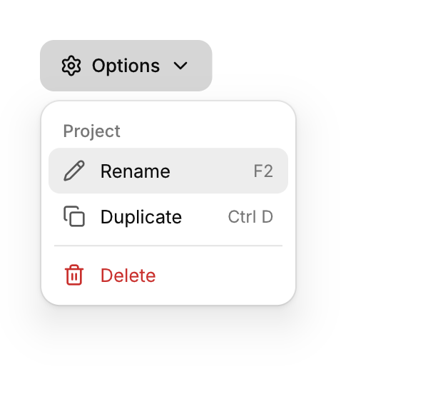
cui_menu(ui, "Options", .icon = CUI_ICON_SETTINGS) {
    cui_menu_label(ui, "Project");
    if (cui_menu_item(ui, "Rename", .icon = CUI_ICON_PENCIL, .shortcut = "F2")) rename();
    cui_menu_separator(ui);
    if (cui_menu_item(ui, "Delete", .icon = CUI_ICON_TRASH_2, .danger = true)) confirm = true;
}

cui_card(ui, .id = "file", .hoverable = true) { ... }
cui_context_menu(ui, "file-menu") {                   /* right click on the previous component */
    cui_menu_item(ui, "Copy", .icon = CUI_ICON_COPY);
}
Menus open with a short scale and fade from the trigger, close on a click outside, Esc or after choosing. Item options: icon, shortcut, danger, disabled, checked. Menu options: icon, variant, placement, width, icon_only. Keyboard: Down opens from the focused trigger, Up/Down move, Enter chooses.
Keyboard
- Menus open with a short scale and fade from the trigger, close on a click outside, Esc or after choosing.
- Down opens from the focused trigger, Up/Down move, Enter chooses.
Options of cui_menu
| Option | Type | Default | Description |
|---|---|---|---|
.icon | const char * | An icon: a CUI_ICON_* constant, or a string from another icon font. | |
.variant | cui_button_variant | One of CUI_BUTTON_DEFAULT, CUI_BUTTON_SECONDARY, CUI_BUTTON_PRIMARY, CUI_BUTTON_OUTLINE, CUI_BUTTON_GHOST, CUI_BUTTON_DANGER or CUI_BUTTON_LINK. | |
.placement | cui_placement | One of CUI_PLACE_BOTTOM_START, CUI_PLACE_BOTTOM, CUI_PLACE_BOTTOM_END, CUI_PLACE_TOP_START, CUI_PLACE_TOP, CUI_PLACE_TOP_END, CUI_PLACE_RIGHT_START, CUI_PLACE_LEFT_START, CUI_PLACE_RIGHT or CUI_PLACE_LEFT. | |
.width | float | Width in points; 0 uses the component's own. | |
.icon_only | bool | an icon button (the ellipsis unless icon is set) with the label as its tooltip |
Options of cui_menu_item
| Option | Type | Default | Description |
|---|---|---|---|
.icon | const char * | An icon: a CUI_ICON_* constant, or a string from another icon font. | |
.shortcut | const char * | The shortcut shown beside it, as text such as "Ctrl N". | |
.danger | bool | Drawn in the danger color, for destructive actions. | |
.disabled | bool | Greyed out, and takes no input. | |
.checked | bool | a check mark at the right edge of the item |
Related
- Menu bar: The File, Edit, View row of a desktop app, with a menu under each title.
- User menu: An avatar, a name and a detail line that open an account menu with a header.
- Popover: A small floating panel anchored to a control, for content that does not need a dialog.
- Tooltip: A short label that appears when the pointer rests on a control.