Components / Overlays
Tooltip
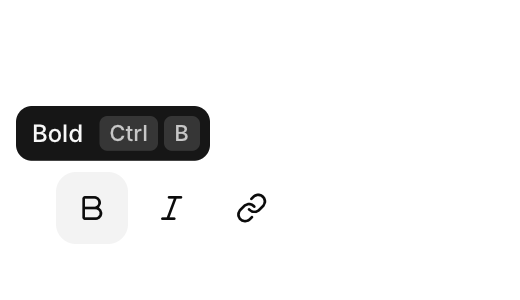
A short label that appears when the pointer rests on a control.
Functions: cui_tooltip
Usage
cui_icon_button(ui, CUI_ICON_BOLD, .tooltip = "Bold", .shortcut = "Ctrl B");   /* buttons take .tooltip */
cui_link(ui, "What is beta?");
cui_tooltip(ui, "Features in beta may change");   /* for the previous component */
Appears after a short delay. Moving on to a neighbour while it is open, it glides there and changes its text instead of popping again.
cui_tooltip returns nothing and takes no id: call it on every frame, right after the component it belongs to. That component must be one that reacts to the pointer, such as a button, a link or a hoverable card. Plain text, a badge and an avatar do not, so a tooltip placed after one of them attaches to whatever interactive component came before. The delay is 0.55 seconds, and none when another tooltip was showing less than 0.4 seconds ago. The text is copied, up to 255 bytes. For a card with its own layout, use a hover card.
Keyboard
A tooltip takes no focus. It belongs to the control before it, which keeps its own keys.
Related
- Hover card: A preview card that opens when the pointer rests on a link, a button or another component that reacts to the pointer.
- Icon button: A round button with only an icon, ghost by default.
- Dialog: A modal window for a decision or a short form, which blocks the rest of the app until it is closed.
- Popover: A small floating panel anchored to a control, for content that does not need a dialog.