Components / Overlays
Dialog
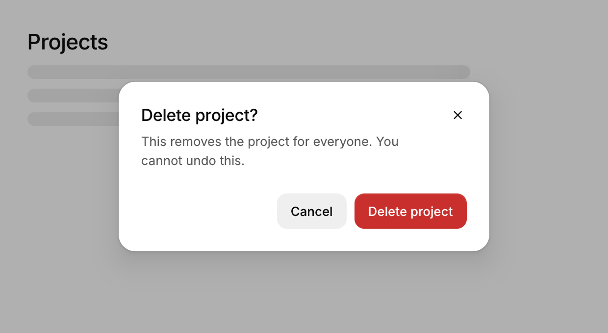
A modal window for a decision or a short form, which blocks the rest of the app until it is closed.
Functions: cui_dialog, cui_dialog_footer
Usage
cui_dialog(ui, "Edit profile", &open, .description = "Changes are visible to your team.") {
    cui_input(ui, "name", name, sizeof name, .label = "Name");
    cui_dialog_footer(ui) {
        if (cui_button(ui, "Cancel")) open = false;
        if (cui_button(ui, "Save", .variant = CUI_BUTTON_PRIMARY)) { save(); open = false; }
    }
}
Modal: the scrim blocks everything behind it. Esc, the close button or a click on the scrim close it, unless persistent. Options: description, width (440), no_close_button, persistent. Opens with a fade and a scale from 0.96, closes faster than it opens.
Keyboard
- Esc, the close button or a click on the scrim close it, unless
persistent.
Options of cui_dialog
| Option | Type | Default | Description |
|---|---|---|---|
.description | const char * | A second line of smaller text. | |
.width | float | 440 | default 440 |
.no_close_button | bool | hides the x in the corner (Esc and a click outside still close it unless persistent) | |
.persistent | bool | clicking outside or Esc does not close |
Related
- Button: Starts an action when clicked. It comes in six variants and three sizes, with an optional icon and a loading state.
- Sheet: A panel that slides in from an edge.
- Tooltip: A short label that appears when the pointer rests on a control.
- Command palette: A search box over the app's commands, opened with a shortcut.