Components / Overlays
Command palette
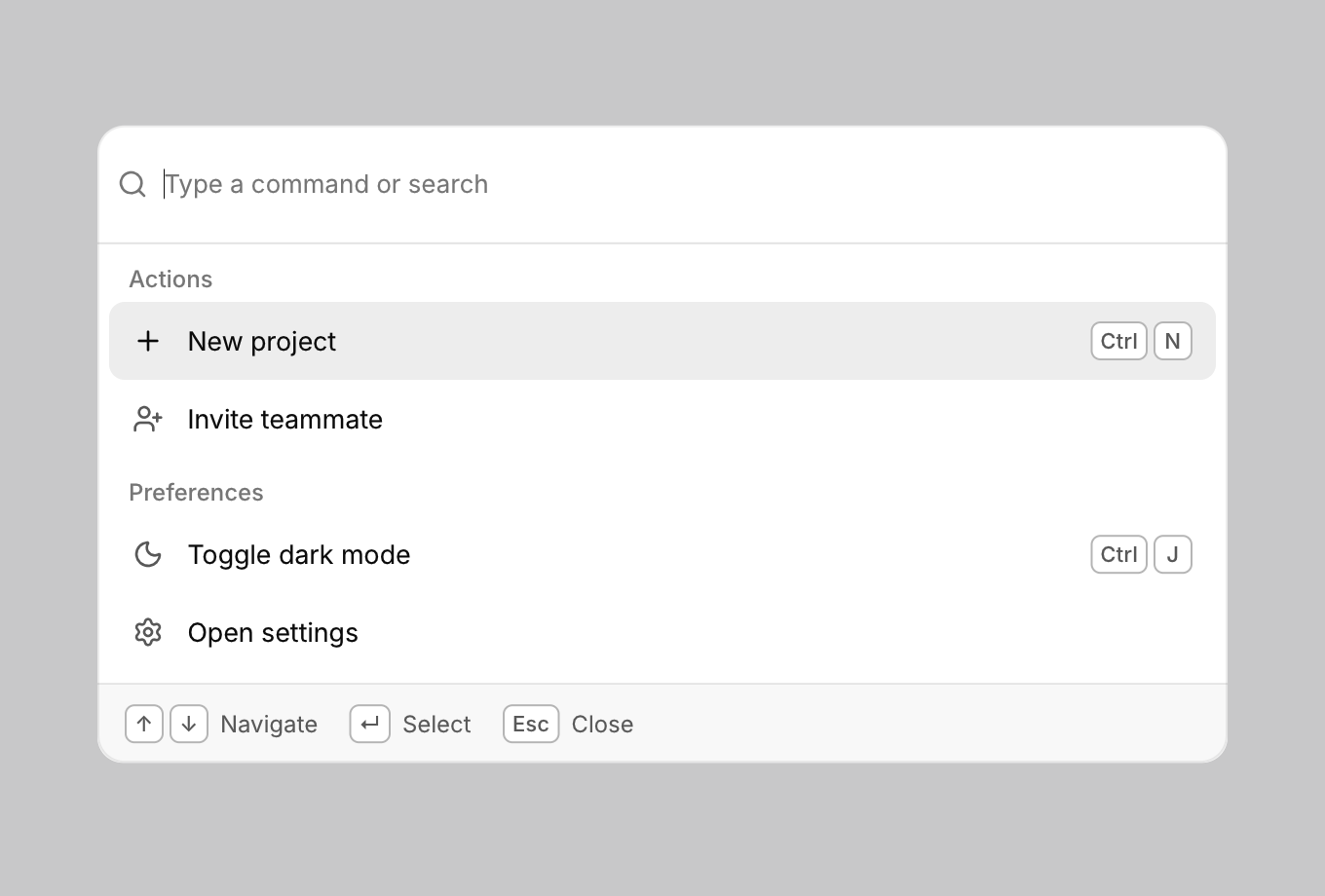
A search box over the app's commands, opened with a shortcut.
Functions: cui_command_palette
Usage
static const cui_command commands[] = {
    { "New project", CUI_ICON_PLUS, "Actions", "Ctrl N" },
    { "Toggle dark mode", CUI_ICON_MOON, "Preferences", NULL },
};
if (cui_shortcut(ui, CUI_MOD_PRIMARY, CUI_KEY_K)) palette = true;
int chosen = cui_command_palette(ui, &palette, commands, 2);   /* index or -1 */
Fuzzy search with ranking, grouped results, Up/Down to move, Enter to run, Esc to close.
Returns the index of the chosen command in your array, on the frame it is chosen, and -1 otherwise. palette is your bool: the palette shows while it is true, and choosing a command, a click outside and the close key set it to false. Each cui_command is a title, an icon, a group and a shortcut, and any but the title may be NULL. Group headings show while the search is empty, one above each run of commands with the same group, so keep those commands next to each other in the array. The shortcut is only shown as a hint: binding it is cui_shortcut in your own code.
Keyboard
- Fuzzy search with ranking, grouped results, Up/Down to move, Enter to run, Esc to close.
cui_command
| Field | Type | Description |
|---|---|---|
title | const char * | the command's text in the list; what typing in the palette searches |
icon | const char * | An icon: a CUI_ICON_* constant, or a string from another icon font. |
group | const char * | heading above a run of commands with the same group, shown while the search is empty |
shortcut | const char * | The shortcut shown beside it, as text such as "Ctrl N". |
Related
- Shortcut recorder: A field that records a key combination, for settings where people choose their own shortcuts.
- Hover card: A preview card that opens when the pointer rests on a link, a button or another component that reacts to the pointer.
- Sheet: A panel that slides in from an edge.
- Confirm popover: A small question anchored to the button that opened it.