Components / Overlays
Confirm popover
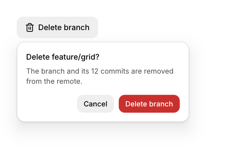
A small question anchored to the button that opened it.
Functions: cui_confirm_popover, cui_popover_open
Usage
if (cui_button(ui, "Delete branch")) cui_popover_open(ui, "confirm-delete");
if (cui_confirm_popover(ui, "confirm-delete", .title = "Delete feature/grid?", .description = "This cannot be undone.",
                        .confirm_label = "Delete branch", .danger = true))
    delete_branch();
Focus moves to the confirm button, so Enter confirms and Esc cancels.
Returns true once, on the frame the question is confirmed, and closes itself. The cancel button and a click outside close it too. You keep no state: the popover stays closed until cui_popover_open(ui, id) is called with the same id in the same id scope. It anchors to the previous component, so call cui_confirm_popover on every frame right after the button, not inside the button's if. title and description wrap in a panel 290 points wide. confirm_label and cancel_label default to "Confirm" and "Cancel", and danger gives the confirm button the danger color. A confirm button asks with a second click and no text, and a dialog blocks the whole window.
Keyboard
- Focus moves to the confirm button, so Enter confirms and Esc cancels.
Options of cui_confirm_popover
| Option | Type | Default | Description |
|---|---|---|---|
.title | const char * | the question, in medium weight at the top, e.g. "Delete this file?" | |
.description | const char * | A second line of smaller text. | |
.confirm_label | const char * | "Confirm" | default "Confirm" |
.cancel_label | const char * | "Cancel" | default "Cancel" |
.danger | bool | Drawn in the danger color, for destructive actions. | |
.placement | cui_placement | One of CUI_PLACE_BOTTOM_START, CUI_PLACE_BOTTOM, CUI_PLACE_BOTTOM_END, CUI_PLACE_TOP_START, CUI_PLACE_TOP, CUI_PLACE_TOP_END, CUI_PLACE_RIGHT_START, CUI_PLACE_LEFT_START, CUI_PLACE_RIGHT or CUI_PLACE_LEFT. |
Related
- Confirm button: A button for destructive actions that asks for a second click before it fires.
- Button: Starts an action when clicked. It comes in six variants and three sizes, with an optional icon and a loading state.
- Expandable text and card: Long text clamped to a few lines with a Show more link, and a card that opens to show its details.
- Hover card: A preview card that opens when the pointer rests on a link, a button or another component that reacts to the pointer.