Components / Overlays
Expandable text and card
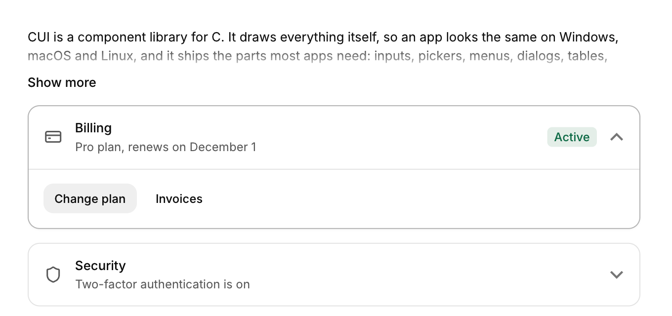
Long text clamped to a few lines with a Show more link, and a card that opens to show its details.
Functions: cui_expandable_card, cui_expandable_text
Usage
cui_expandable_text(ui, "about", long_text, .lines = 3);

static bool billing_open;
cui_expandable_card(ui, "Billing", &billing_open, .description = "Pro plan", .icon = CUI_ICON_CREDIT_CARD, .badge = "Active") {
    cui_button(ui, "Change plan");
}
Expandable text clamps to lines with a fade (into fade_to, the background by default) and a Show more / Show less link; the height springs. The card's body opens with a height spring and its chevron turns; content inside is disabled while it closes.
Keyboard
- Tab focuses the "Show more" link or the card's header, and Enter or Space expands or collapses it.
Options of cui_expandable_card
| Option | Type | Default | Description |
|---|---|---|---|
.description | const char * | A second line of smaller text. | |
.icon | const char * | An icon: a CUI_ICON_* constant, or a string from another icon font. | |
.badge | const char * | small badge in the header before the chevron, colored by badge_tone; NULL for none | |
.badge_tone | cui_tone | One of CUI_TONE_NEUTRAL, CUI_TONE_INFO, CUI_TONE_SUCCESS, CUI_TONE_WARNING, CUI_TONE_DANGER, CUI_TONE_VIOLET, CUI_TONE_TEAL, CUI_TONE_ROSE or CUI_TONE_ACCENT. |
Options of cui_expandable_text
| Option | Type | Default | Description |
|---|---|---|---|
.lines | int | 3 | lines shown while collapsed, default 3 |
.size | float | Size in points; 0 uses the component's own. | |
.color | cui_color | A theme color such as CUI_COLOR_ACCENT, or CUI_RGB(0x7747ff); unset uses the theme's. | |
.fade_to | cui_color | the background | color the last line fades into; set it to the surface behind the text, default the background |
Related
- Button: Starts an action when clicked. It comes in six variants and three sizes, with an optional icon and a loading state.
- Guided tour: A spotlight on one control at a time, with a card beside it saying what the control does, for onboarding and "what's new".
- Confirm popover: A small question anchored to the button that opened it.
- Hover card: A preview card that opens when the pointer rests on a link, a button or another component that reacts to the pointer.