Components / Overlays
Guided tour
A spotlight on one control at a time, with a card beside it saying what the control does, for onboarding and "what's new".
Functions: cui_last_id, cui_tour
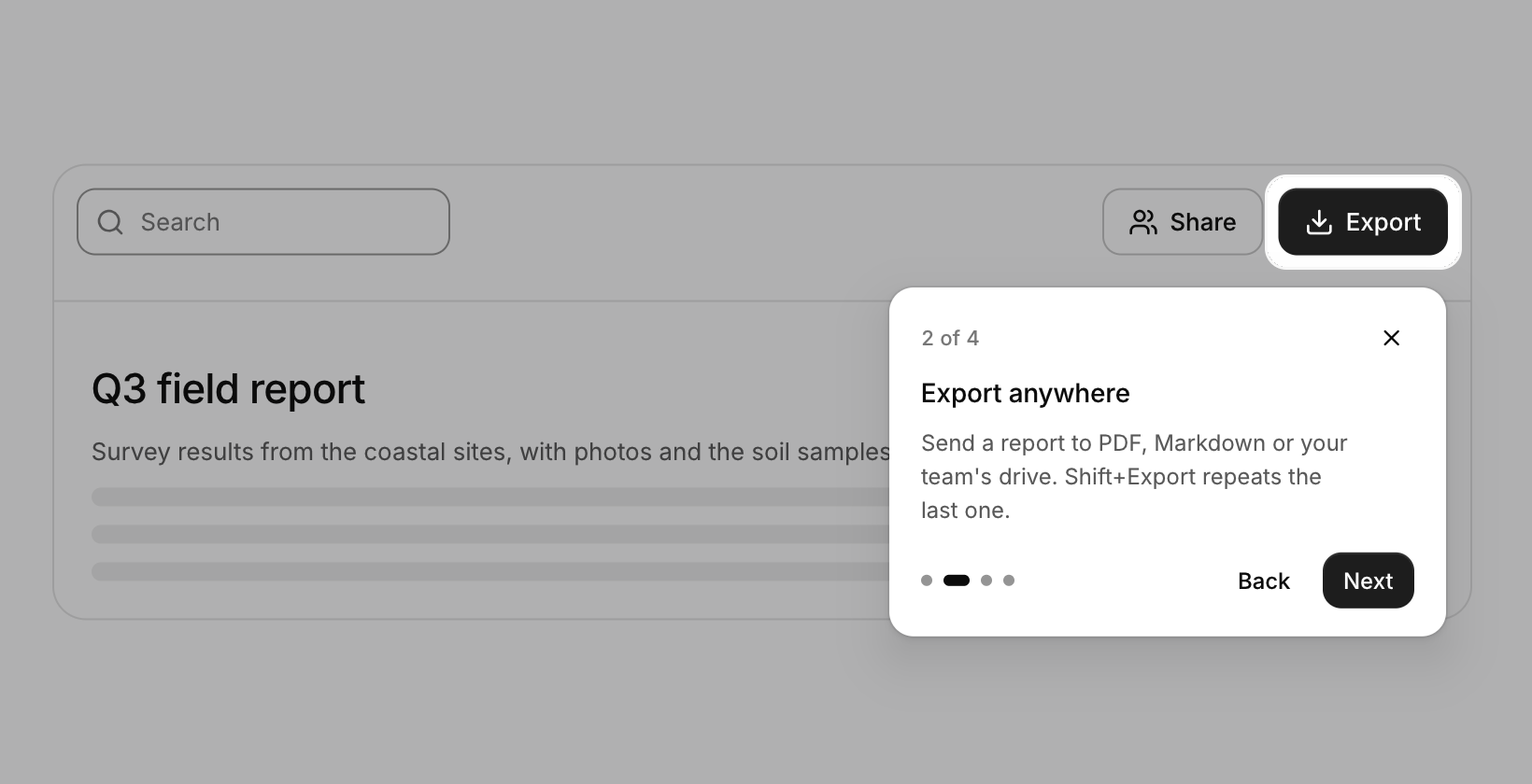
Usage
static cui_tour_step steps[] = {
    { 0, "Welcome to Fieldnotes", "A quick look at the three things you will use every day." },
    { 0, "Export anywhere", "Send a report to PDF, Markdown or your team's drive.", CUI_PLACE_BOTTOM_END },
    { 0, "Search everything", "Ctrl K finds notes, people and commands." },
};
static int step = 0;                       /* -1 when no tour is running */

cui_search(ui, "q", query, sizeof query);  steps[2].target = cui_last_id(ui);
cui_button(ui, "Export");                  steps[1].target = cui_last_id(ui);
/* ... the rest of the window ... */
if (step >= 0 && cui_tour(ui, "intro", steps, 3, &step) == CUI_TOUR_DONE) save_tour_seen();
The window dims around a rounded hole over the step's target, and the hole glides from one control to the next. A step without a target puts its card in the middle of a fully dimmed window, which suits a welcome or a closing note. The card shows the step count, the title and body, progress dots, Back and Next (Done on the last step) and a close button; placement picks its side of the target and it flips to stay on screen.
Call it after the controls it points at, so their positions are known, and keep calling it while step is 0 or more. It moves step itself and sets it to -1 when the tour ends, and returns what happened that frame: CUI_TOUR_NEXT, CUI_TOUR_BACK, CUI_TOUR_DONE or CUI_TOUR_SKIPPED. Right or Enter go to the next step, Left goes back and Esc ends the tour. The spotlighted control still takes the pointer, so people can try it as they read (block_target turns that off), while clicks anywhere else in the dark are swallowed. width sets the card, padding the room around the target, and next_label, back_label, done_label and count_format ("%d of %d") the text in another language.
Keyboard
- Right or Enter go to the next step, Left goes back and Esc ends the tour.
Options of cui_tour
| Option | Type | Default | Description |
|---|---|---|---|
.width | float | 300 | the card, default 300 |
.padding | float | 6 | room around the target inside the spotlight, default 6 |
.block_target | bool | the spotlighted control ignores the pointer too | |
.next_label | const char * | "Next", "Back", "Done" | default "Next", "Back", "Done" |
.back_label | const char * | "Next", "Back", "Done" | default "Next", "Back", "Done" |
.done_label | const char * | "Next", "Back", "Done" | default "Next", "Back", "Done" |
.count_format | const char * | "%d of %d" (step, then total) | the step count, default "%d of %d" (step, then total) |
cui_tour_step
| Field | Type | Description |
|---|---|---|
target | cui_id | the control to point at (cui_last_id after it); 0: a card in the middle |
title | const char * | heading of the step's card; NULL or "" leaves it out |
body | const char * | the explanation under the title; wraps to the card's width |
placement | cui_placement | the card's side of the target, default below it |
cui_placement: CUI_PLACE_BOTTOM_START, CUI_PLACE_BOTTOM, CUI_PLACE_BOTTOM_END, CUI_PLACE_TOP_START, CUI_PLACE_TOP, CUI_PLACE_TOP_END, CUI_PLACE_RIGHT_START, CUI_PLACE_LEFT_START, CUI_PLACE_RIGHT, CUI_PLACE_LEFT
Related
- Button: Starts an action when clicked. It comes in six variants and three sizes, with an optional icon and a loading state.
- Expandable text and card: Long text clamped to a few lines with a Show more link, and a card that opens to show its details.
- Confirm popover: A small question anchored to the button that opened it.
- Hover card: A preview card that opens when the pointer rests on a link, a button or another component that reacts to the pointer.