Components / Overlays
Hover card
A preview card that opens when the pointer rests on a link, a button or another component that reacts to the pointer.
Functions: cui_hover_card
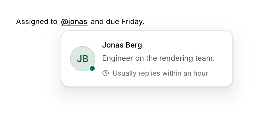
Usage
cui_link(ui, "@jonas");
cui_hover_card(ui, "grace", .width = 300) {
    cui_avatar(ui, "Jonas Berg", .size = 44);
    cui_text(ui, "Design lead on the mobile app.");
}
Attaches to the previous component. It opens after the pointer rests there for delay seconds (0.45) and stays open while the pointer is over the anchor or the card, with a short grace period to cross the gap.
The block runs only while the card is on screen, and you keep no state. id must differ for every card in the same scope. The previous component is the last one that reacts to the pointer, such as a link, a button or a hoverable card. Plain text, a badge and a bare avatar do not, so a card placed after one of them attaches to whatever interactive component came before. A click on the anchor closes the card.
Keyboard
The card opens on hover and takes no focus, so do not put anything in it that cannot be reached another way.
Options of cui_hover_card
| Option | Type | Default | Description |
|---|---|---|---|
.placement | cui_placement | One of CUI_PLACE_BOTTOM_START, CUI_PLACE_BOTTOM, CUI_PLACE_BOTTOM_END, CUI_PLACE_TOP_START, CUI_PLACE_TOP, CUI_PLACE_TOP_END, CUI_PLACE_RIGHT_START, CUI_PLACE_LEFT_START, CUI_PLACE_RIGHT or CUI_PLACE_LEFT. | |
.width | float | Width in points; 0 uses the component's own. | |
.delay | float | 0.45 | seconds the pointer must rest on the component before the card shows, default 0.45 |
Related
- Confirm popover: A small question anchored to the button that opened it.
- Command palette: A search box over the app's commands, opened with a shortcut.
- Expandable text and card: Long text clamped to a few lines with a Show more link, and a card that opens to show its details.
- Sheet: A panel that slides in from an edge.