Components / Navigation
Tabs
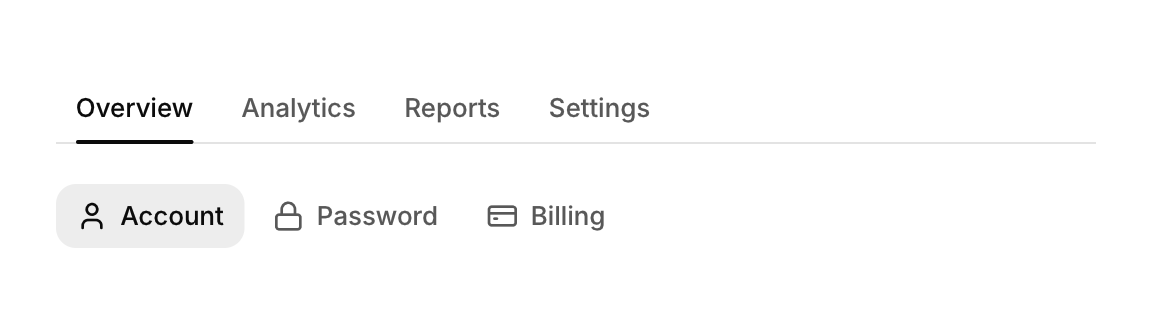
Switches between views with a row of labels and an underline that slides to the active one.
Functions: cui_tabs
Usage
static int tab = 0;
const char *tabs[] = { "Overview", "Analytics", "Reports" };
cui_tabs(ui, "tabs", tabs, 3, &tab);
cui_tabs(ui, "account", items, 3, &sel, .variant = CUI_TABS_PILL, .icons = icons);
switch (tab) { /* content */ }
The underline slides to the active tab. Keyboard: Left and Right. Tabs never truncate their labels: when they are wider than their container the strip scrolls sideways, fades at the edge that has more, and brings a newly selected tab into view.
Returns true on the frame the selected tab changes. tab is your int: the tabs write it on a click and keep it between 0 and count - 1. Tabs draw only the strip, so showing the content of the selected tab is your switch below it. Set the index from code and the strip scrolls that tab into view. At most 32 tabs are shown. Options: variant (CUI_TABS_UNDERLINE, the default, or CUI_TABS_PILL), icons and full_width. For a compact choice between views of the same content, use a segmented control.
Keyboard
- Left and Right.
Options of cui_tabs
| Option | Type | Default | Description |
|---|---|---|---|
.variant | cui_tabs_variant | One of CUI_TABS_UNDERLINE or CUI_TABS_PILL. | |
.icons | const char *const * | One icon per item, in the same order as the items. | |
.full_width | bool | Stretches to the width of its container. |
Related
- Segmented control: A compact set of two to five choices where one is always selected, for switching between views of the same content.
- Sidebar navigation: The items and section titles of an app's sidebar, with one highlight that follows the selection.
- Breadcrumb, pagination and stepper: Three ways to show position: the path to a page, the page of a list, and the step of a process.
- Table of contents: A list of a page's sections that follows the reader and scrolls to a section when clicked.