Components / Conversation and media
Presence, counter and ticker
Small live pieces: who is here now, a number that rolls when it changes, and a line of text that scrolls past.
Functions: cui_counter, cui_presence, cui_ticker
Usage
cui_presence(ui, "here", users, 7, 5, 30);                     /* show 5, then "+2" */
cui_counter(ui, "revenue", revenue, .format = "$%.0f", .size = 34, .group_thousands = true);
static const cui_ticker_item items[] = { { "Builds", "1,204", 12.0f }, { "Latency", "182 ms", -8.4f, true } };
cui_ticker(ui, "kpis", items, 2);   /* true: lower is better, so the fall shows green */
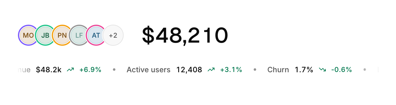
Presence avatars overlap with colored rings and spread out under the pointer; idle people are dimmed. The counter rolls each digit like an odometer when the value changes. The ticker scrolls continuously, fades at the edges and pauses under the pointer.
None of the three returns anything. cui_presence reads your array of cui_presence_user: a name, a ring color, an optional avatar texture and idle. Its last two arguments are how many avatars to show before the "+N" and the avatar size in points; 0 means 5 and 30.
cui_counter takes the value on every frame and keeps only the position of each digit under id. format is a printf format for one double ("%.0f" when not set), and size is in points (32).
Each cui_ticker_item is a label, a value as text, a change in percent and lower_is_better. The ticker fills the width and moves at speed points per second (40).
Options of cui_counter
| Option | Type | Default | Description |
|---|---|---|---|
.format | const char * | A printf format for the values, such as "%.0f ms". | |
.size | float | Size in points; 0 uses the component's own. | |
.font | cui_font | `CUI_FONT_DISPLAY` | default CUI_FONT_DISPLAY |
.color | cui_color | A theme color such as CUI_COLOR_ACCENT, or CUI_RGB(0x7747ff); unset uses the theme's. | |
.group_thousands | bool | commas between thousands: 48210 shows as 48,210 |
Options of cui_ticker
| Option | Type | Default | Description |
|---|---|---|---|
.speed | float | 40 | points per second, default 40 |
.height | float | Height in points; 0 uses the component's own. |
cui_presence_user
| Field | Type | Description |
|---|---|---|
name | const char * | shown in the tooltip, and as initials when there is no avatar |
color | cui_color | A theme color such as CUI_COLOR_ACCENT, or CUI_RGB(0x7747ff); unset uses the theme's. |
avatar | cui_texture | picture to show instead of the initials |
idle | bool | away: the avatar dims, its ring turns gray and the tooltip adds "(away)" |
cui_ticker_item
| Field | Type | Description |
|---|---|---|
label | const char * | A label shown above or beside the control. |
value | const char * | text after the label in medium weight, e.g. a price; may be NULL |
delta | float | percent change, shown with a trend arrow in green or red; 0 hides it |
lower_is_better | bool | a fall in delta is good news: it shows green, and a rise red |
Related
- Carousel: A strip of slides the user drags or steps through, one at a time.
- Comments: A comment with its author, time, replies indented under it and a like button.
- Image compare and card stack: A divider that reveals one picture over another, and a stack of cards the user swipes through.
- Chat: Message bubbles for a conversation, with grouping, dividers and a typing indicator.