Components / Conversation and media
Image compare and card stack
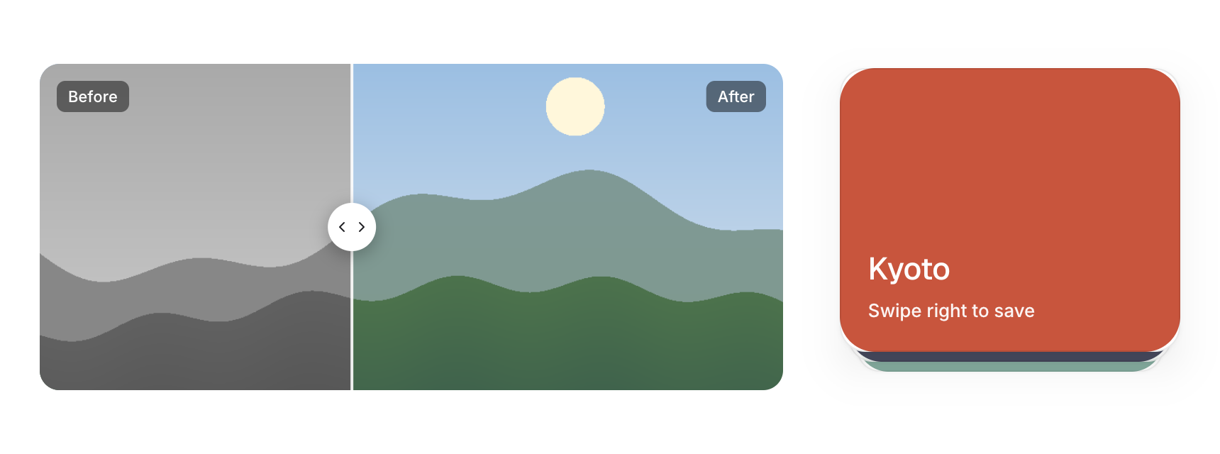
A divider that reveals one picture over another, and a stack of cards the user swipes through.
Functions: cui_card_stack_begin, cui_card_stack_end, cui_card_stack_item, cui_image_compare
Usage
static float split = 0.5f;
cui_image_compare(ui, "cmp", before, after, &split, .height = 230, .aspect = 1600.0f / 1000.0f);

cui_card_stack_begin(ui, "deck", 3, &(cui_card_stack_opts){ .width = CUI_PX(240), .height = 200 });
for (int k = 0; k < 3; k++) cui_card_stack_item(ui, k) { draw_card(ui, deck[k]); }
int dir = cui_card_stack_end(ui);   /* -1 or 1 when the top card was thrown left or right */
Drag the divider, or focus it and use the arrow keys. Pass the pictures' aspect (width over height) and they are cropped to fill the box instead of stretched. The top card of the stack follows the pointer; past a third of its width, or with a fast flick, it flies off and the cards behind move up. Cards clip their content to a rectangle, so content that fills a card gives itself a radius of 25 (the card's 26, less its 1px border) and its corners line up.
Keyboard
- Drag the divider, or focus it and use the arrow keys.
Options of cui_card_stack_begin
| Option | Type | Default | Description |
|---|---|---|---|
.width | cui_size | Width: CUI_FILL, CUI_FIT, CUI_PX(n) or CUI_PCT(n); unset uses the component's own. | |
.height | float | Height in points; 0 uses the component's own. | |
.visible | int | 3 | cards of the deck that show at once, default 3 |
Options of cui_image_compare
| Option | Type | Default | Description |
|---|---|---|---|
.width | cui_size | Width: CUI_FILL, CUI_FIT, CUI_PX(n) or CUI_PCT(n); unset uses the component's own. | |
.height | float | Height in points; 0 uses the component's own. | |
.before_label | const char * | "Before" | caption in the top left corner, default "Before" |
.after_label | const char * | "After" | caption in the top right corner, default "After" |
.aspect | float | the images' width / height: they are cropped to fill, never stretched |
Related
- Image viewer and cropper: A picture you can zoom and pan, and a crop tool with a frame you drag.
- Carousel: A strip of slides the user drags or steps through, one at a time.
- Presence, counter and ticker: Small live pieces: who is here now, a number that rolls when it changes, and a line of text that scrolls past.
- Comments: A comment with its author, time, replies indented under it and a like button.