Components / Conversation and media
Comments
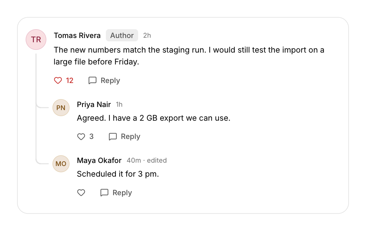
A comment with its author, time, replies indented under it and a like button.
Functions: cui_comment
Usage
static int likes = 12; static bool liked = true;
int act = cui_comment(ui, "c1", "Tomas Rivera", text, .time = "2h", .likes = &likes, .liked = &liked, .badge = "Author");
if (act & CUI_COMMENT_REPLY) open_reply_box();
cui_comment(ui, "c2", "Priya Nair", "Agreed, one more run.", .time = "1h", .depth = 1);
depth indents replies under a thread line. The like button toggles liked and keeps likes in step.
Returns flags for what was clicked this frame: CUI_COMMENT_LIKE, CUI_COMMENT_REPLY, or 0. likes and liked point at your variables. With liked set, a click on the heart flips it and moves likes by one; without it the click is only reported. likes may be NULL, and a count of 0 is not shown. The reply button only reports: opening a field for the answer is up to you. id scopes the comment's buttons, so every comment needs its own, such as the id of its record. time is text you format yourself, and edited shows only when time is set. Each level of depth indents by 44 points.
Keyboard
- Tab moves through each comment's actions (like and reply), and Enter or Space presses the focused one.
Options of cui_comment
| Option | Type | Default | Description |
|---|---|---|---|
.time | const char * | muted text after the author's name, e.g. "2h ago" | |
.depth | int | 0 for a top level comment; each level indents a reply 44 points under a connector line | |
.likes | int * | the like count, shown beside the heart; changed with *liked. May be NULL | |
.liked | bool * | whether you liked it: tints the heart and flips on a click. NULL: the click is only reported | |
.edited | bool | adds "edited" after the time | |
.badge | const char * | small badge after the author's name, e.g. "Author" |
Related
- Presence, counter and ticker: Small live pieces: who is here now, a number that rolls when it changes, and a line of text that scrolls past.
- Chat: Message bubbles for a conversation, with grouping, dividers and a typing indicator.
- Carousel: A strip of slides the user drags or steps through, one at a time.
- Image compare and card stack: A divider that reveals one picture over another, and a stack of cards the user swipes through.