Components / Data display
Data grid and filter bar
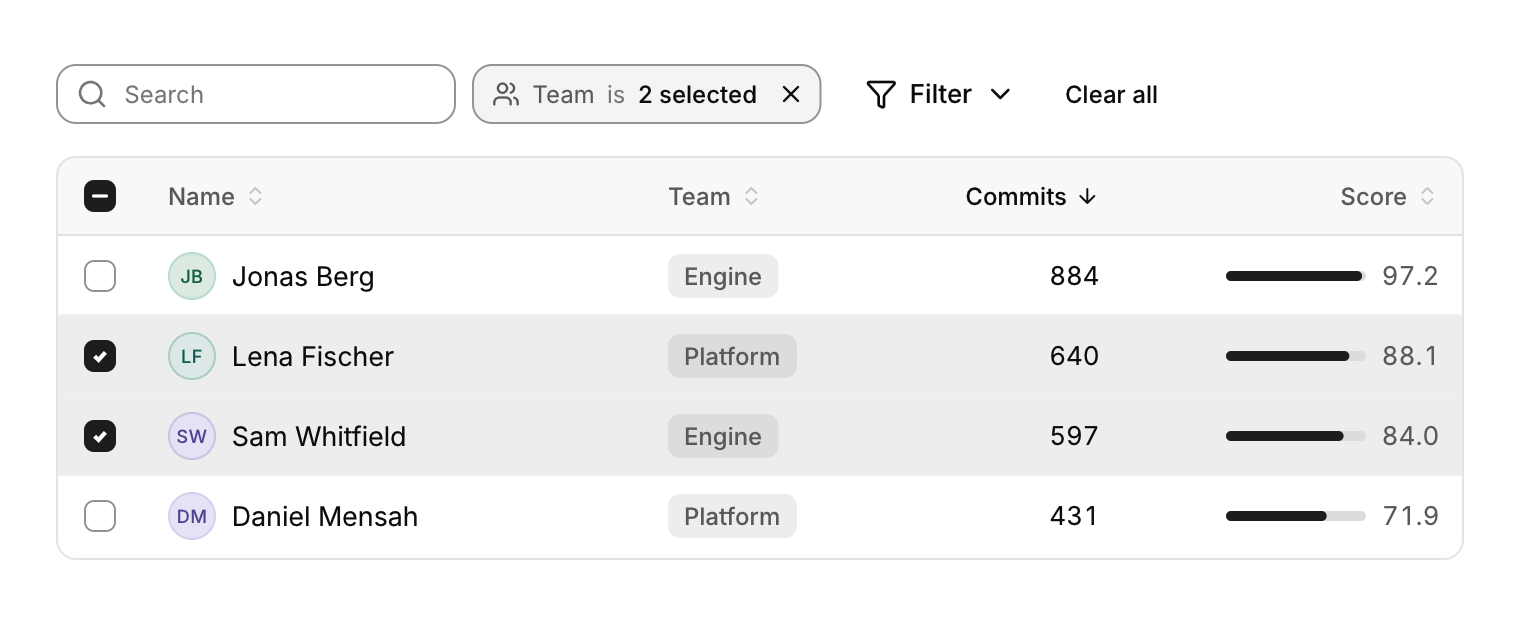
A grid for very large data with sticky headers, resizable and sortable columns and editable cells, and a bar of filters to go with it.
Functions: cui_data_grid_begin, cui_data_grid_cell, cui_data_grid_cell_text, cui_data_grid_edit, cui_data_grid_end, cui_data_grid_row, cui_filter_bar
Usage
static const cui_grid_column cols[] = {
    { "Name", 210, CUI_TEXT_LEFT, true }, { "Team", 120, CUI_TEXT_LEFT, true }, { "Commits", 100, CUI_TEXT_RIGHT, true },
};
static bool selected[2000];
static cui_table_sort sort = { 2, true };
int first, last;
cui_filter_bar(ui, "filters", fields, 2, filter_masks, search, sizeof search);
if (cui_data_grid_begin(ui, "people", cols, 3, 2000, &first, &last, .height = CUI_PX(420), .selected = selected, .sort = &sort)) {
    for (int r = first; r < last; r++) {
        cui_data_grid_row(ui, r);
        cui_data_grid_cell(ui);
        cui_avatar(ui, people[r].name, .size = 24);
        cui_data_grid_edit(ui, people[r].name, sizeof people[r].name);   /* double click to rename */
        cui_data_grid_cell_text(ui, people[r].team);
        cui_data_grid_cell_text(ui, people[r].commits_text);
    }
    cui_data_grid_end(ui);
}
Only the rows in view are built, so the row count barely matters. Headers are sticky; drag a header edge to resize a column; click a sortable header to set sort (you reorder your data). With selected, a checkbox column appears and rows select like a spreadsheet: click, Shift+click for a range, Ctrl+click to toggle, Ctrl+A for all, arrows to move the cursor, Esc to clear. Editable cells start on double click or Enter and commit on Enter or clicking away.
The filter bar keeps one bit mask per field in selected; each active field shows as a chip that opens its value list, "Filter" adds one and "Clear all" resets them. cui_tree_cell draws a disclosure chevron and indentation inside any table or grid cell for tree tables.
Keyboard
- With
selected, a checkbox column appears and rows select like a spreadsheet: click, Shift+click for a range, Ctrl+click to toggle, Ctrl+A for all, arrows to move the cursor, Esc to clear. - Editable cells start on double click or Enter and commit on Enter or clicking away.
Options of cui_data_grid_begin
| Option | Type | Default | Description |
|---|---|---|---|
.width | cui_size | fill | default fill |
.height | cui_size | fill | default fill |
.row_height | float | 40 | default 40 |
.selected | bool * | one bool per row; adds a checkbox column | |
.sort | cui_table_sort * | optional; a click on a sortable header updates it and the header shows its arrow. Sort the rows yourself | |
.striped | bool | Shades every other row. | |
.cursor | int * | the keyboard row, optional; setting it scrolls that row into view | |
.hide_checkboxes | bool | with selected: rows still select (click, Shift, Ctrl) but no checkbox column | |
.anchor | int * | the row Shift ranges start from, optional (in and out like cursor) |
cui_grid_column
| Field | Type | Description |
|---|---|---|
title | const char * | text of the column's header |
width | float | initial width in points, default 150 |
align | cui_text_align | One of CUI_TEXT_START, CUI_TEXT_CENTER, CUI_TEXT_RIGHT, CUI_TEXT_LEFT or CUI_TEXT_END. |
sortable | bool | The column's header can be clicked to sort by it. |
fixed | bool | not resizable |
priority | int | 0 always shown; when the grid is too narrow, columns with a priority hide, the highest number first, until the rest fit |
cui_text_align: CUI_TEXT_START, CUI_TEXT_CENTER, CUI_TEXT_RIGHT, CUI_TEXT_LEFT, CUI_TEXT_END
cui_filter_field
| Field | Type | Description |
|---|---|---|
name | const char * | the field's name, on its chip and in the "+ Filter" menu |
icon | const char * | An icon: a CUI_ICON_* constant, or a string from another icon font. |
options | const char *const * | the values to choose from; at most 32, one bit of the mask each |
option_count | int | number of options |
Related
- Tree table and path bar: A tree with columns, as in a file explorer or a debugger's variables, and a path bar for moving up through folders.
- Reorderable list: A list whose rows the user drags into a new order.
- File browser and picker: A folder view with sorting and navigation, and the open and save dialogs built from it.
- Timeline and progress ring: A vertical list of events in order, and a ring that fills with a percentage.