Components / Data display
Timeline and progress ring
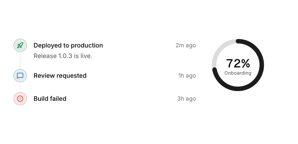
A vertical list of events in order, and a ring that fills with a percentage.
Functions: cui_progress_ring, cui_timeline_item
Usage
cui_timeline_item(ui, "Deployed to production", .time = "2m ago", .description = "Release 1.0.3 is live.",
                  .icon = CUI_ICON_ROCKET, .tone = CUI_TONE_SUCCESS);
cui_timeline_item(ui, "Build failed", .time = "3h ago", .icon = CUI_ICON_CIRCLE_ALERT, .tone = CUI_TONE_DANGER, .last = true);
cui_progress_ring(ui, "Onboarding", 0.72f, 110);
Neither returns anything or takes the pointer. cui_timeline_item draws one event: call it once for each event, in order, inside a column. The title is the only required text. time is text you format yourself, and description wraps under the title. icon goes in the round marker, a dot when not set, and tone colors the marker. Set .last = true on the final item, or its connector line runs on below it.
cui_progress_ring takes a label, a fraction from 0 to 1 and a size in points. The fraction is clamped and shown in the middle as a whole percentage, the ring glides to a new value, and a size of 0 means 96. The label is also the ring's identity, so two rings with the same label in one scope need a key ("Done##week").
Options of cui_timeline_item
| Option | Type | Default | Description |
|---|---|---|---|
.time | const char * | muted text at the right of the title, e.g. "2h ago" | |
.description | const char * | A second line of smaller text. | |
.icon | const char * | An icon: a CUI_ICON_* constant, or a string from another icon font. | |
.tone | cui_tone | One of CUI_TONE_NEUTRAL, CUI_TONE_INFO, CUI_TONE_SUCCESS, CUI_TONE_WARNING, CUI_TONE_DANGER, CUI_TONE_VIOLET, CUI_TONE_TEAL, CUI_TONE_ROSE or CUI_TONE_ACCENT. | |
.last | bool | the final item: no connector line below its dot and no space after it |
Related
- Reorderable list: A list whose rows the user drags into a new order.
- Accordion: Sections that fold open and closed under their headers.
- Data grid and filter bar: A grid for very large data with sticky headers, resizable and sortable columns and editable cells, and a bar of filters to go with it.
- List and tree: List rows with an avatar or an icon, a title and a detail line, and a tree of items that fold.