Components / Inputs
Text field
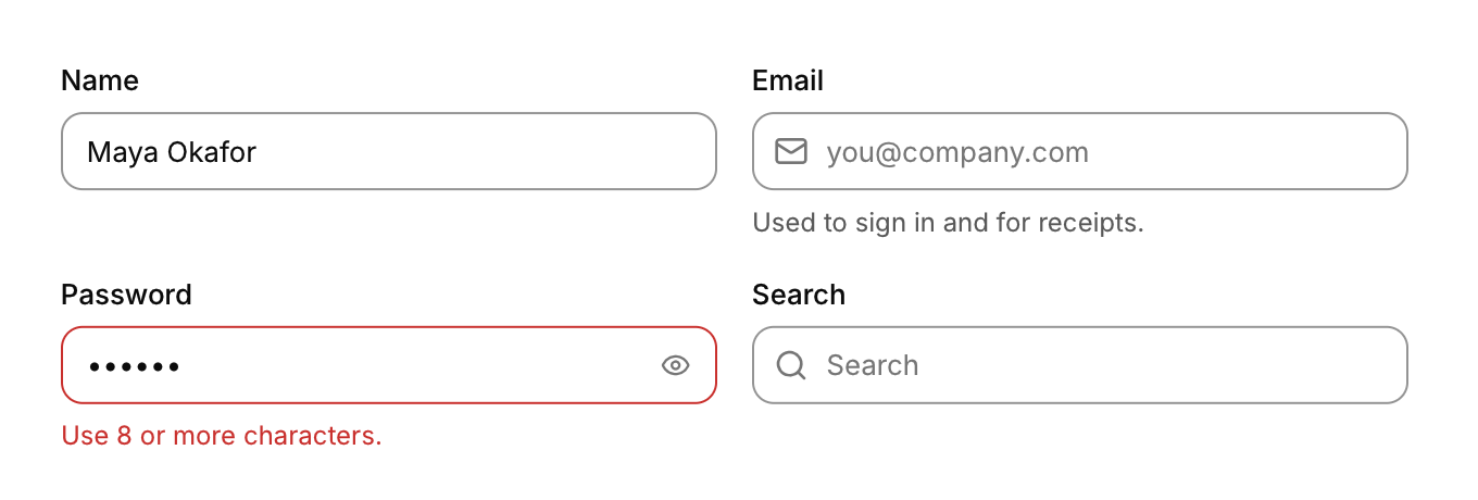
A single-line field that edits text in a buffer you own, with a label, an icon, a hint and an error. The search field is a variant.
Functions: cui_input, cui_search
Usage
static char email[128];
int r = cui_input(ui, "email", email, sizeof email, .label = "Email", .icon = CUI_ICON_MAIL,
                  .placeholder = "you@company.com", .hint = "Used to sign in and for receipts.");
if (r & CUI_CHANGED) validate();
if (r & CUI_SUBMITTED) submit();          /* Enter */

cui_input(ui, "password", pw, sizeof pw, .label = "Password", .password = true,
          .error = strlen(pw) < 8 ? "Use 8 or more characters." : NULL);
cui_search(ui, "q", query, sizeof query, .placeholder = "Search projects");
You own the buffer; CUI never writes past cap. Returns flags: CUI_CHANGED, CUI_SUBMITTED, CUI_FOCUSED, CUI_BLURRED.
| Option | |
|---|---|
label, placeholder, hint, error | |
icon | Leading icon |
password | Masks the text and adds a show/hide button |
clearable | Adds a clear button when not empty (always on for cui_search). Hidden for read_only fields; Ctrl+Z restores the cleared text |
autofocus, read_only, disabled, size, width |
Editing: click to place the caret, drag or Shift+arrows to select, double click selects a word, triple click selects everything. Ctrl (Option on macOS) with arrows or Backspace moves or deletes by word. Home/End, Ctrl+A, cut, copy, paste, undo and redo (Ctrl+Z, Ctrl+Shift+Z or Ctrl+Y; Cmd on macOS). Esc clears the selection, then leaves the field. Full UTF-8.
Keyboard
- Editing: click to place the caret, drag or Shift+arrows to select, double click selects a word, triple click selects everything.
- Ctrl (Option on macOS) with arrows or Backspace moves or deletes by word.
- Home/End, Ctrl+A, cut, copy, paste, undo and redo (Ctrl+Z, Ctrl+Shift+Z or Ctrl+Y; Cmd on macOS).
- Esc clears the selection, then leaves the field.
Options of cui_input, cui_search
| Option | Type | Default | Description |
|---|---|---|---|
.label | const char * | label above the field | |
.placeholder | const char * | Muted text shown while the field is empty. | |
.icon | const char * | leading icon | |
.hint | const char * | helper text below | |
.error | const char * | error text below (red) | |
.password | bool | shows dots instead of the text, with an eye button that reveals it | |
.disabled | bool | Greyed out, and takes no input. | |
.clearable | bool | x button when not empty | |
.autofocus | bool | Takes the keyboard focus when it first appears. | |
.read_only | bool | Shows the value but does not let it be edited. | |
.size | cui_control_size | One of CUI_SIZE_MD, CUI_SIZE_SM or CUI_SIZE_LG. | |
.width | cui_size | Width: CUI_FILL, CUI_FIT, CUI_PX(n) or CUI_PCT(n); unset uses the component's own. | |
.height | float | textarea: height in points; negative fills the space | |
.prefix | const char * | muted text before the value, e.g. "$" or "https://" | |
.suffix | const char * | muted text after the value, e.g. "USD" or "kg" |
Related
- Text area: A multi-line text field that wraps and scrolls.
- Number field: A field for a number in a range, typed or stepped with its buttons and the arrow keys.
- Tag input: A field that turns typed words into removable chips, kept as a comma separated list.
- One time code: A row of boxes for a verification code, filled by typing or pasting.