Components / Feedback
Progress, meter, spinner and skeleton
Ways to show waiting and amounts: a progress bar, a meter against a limit, a spinner, a gauge and placeholder shapes for content that is loading.
Functions: cui_gauge, cui_meter, cui_progress, cui_skeleton, cui_spinner
Usage
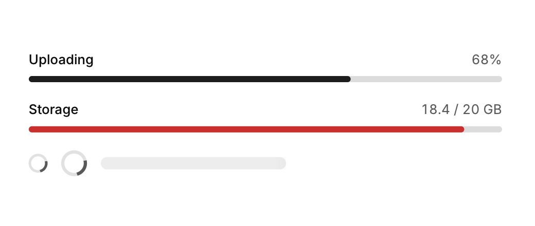
cui_progress(ui, 0.68f, .label = "Uploading", .show_value = true);
cui_progress(ui, 0, .indeterminate = true);
cui_meter(ui, "Storage", 18.4f, 20, "GB");     /* turns amber and red near the limit */
cui_spinner(ui, 20);
cui_skeleton(ui, CUI_PCT(60), 12);             /* shimmering placeholder */
cui_gauge(ui, "CPU", 0.42f, 130);
None of these returns anything or takes the pointer. cui_progress takes a fraction from 0 to 1, clamped, and glides to a new value. With indeterminate the value is ignored and a short segment travels along the track. Options: label and show_value, which add a row above the bar with the name and a whole percentage, tone, height in points (6) and width. cui_meter takes an amount, a limit and a unit as text, prints them as "18.4 / 20 GB", and turns amber above 75% and red above 90% of the limit. cui_spinner takes its size in points, and 0 means 20. cui_skeleton takes a width and a height in points (14 when 0). cui_gauge takes a label, a fraction from 0 to 1 and a size in points (140 when 0).
Options of cui_progress
| Option | Type | Default | Description |
|---|---|---|---|
.indeterminate | bool | An animation with no amount, for work of unknown length. | |
.tone | cui_tone | One of CUI_TONE_NEUTRAL, CUI_TONE_INFO, CUI_TONE_SUCCESS, CUI_TONE_WARNING, CUI_TONE_DANGER, CUI_TONE_VIOLET, CUI_TONE_TEAL, CUI_TONE_ROSE or CUI_TONE_ACCENT. | |
.height | float | Height in points; 0 uses the component's own. | |
.label | const char * | A label shown above or beside the control. | |
.show_value | bool | Shows the value as text. | |
.width | cui_size | Width: CUI_FILL, CUI_FIT, CUI_PX(n) or CUI_PCT(n); unset uses the component's own. |
Related
- Empty state: What to show where there is nothing yet: an icon, a title, a line of help and an action.
- Alert: An inline message in a tone of information, success, warning or danger, which can be dismissed.
- Banner and countdown: A full-width announcement that can be dismissed, and a countdown to a moment in time.
- Toast: A short message that appears in a corner and goes away by itself, with an optional action.