Components / Feedback
Onboarding checklist
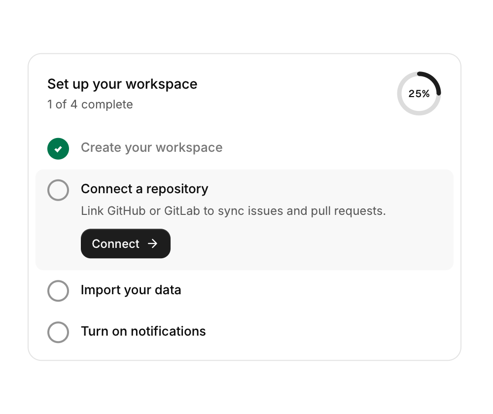
A card with a progress ring and steps; the first unfinished step opens to show its description and action button.
Functions: cui_checklist
Usage
static cui_check_step steps[] = {
    { "Create your workspace", "Pick a name and invite your team.", "Create", true },
    { "Connect a repository", "Sync issues and pull requests.", "Connect", false },
};
int act = cui_checklist(ui, "onboarding", steps, 2, .title = "Set up your workspace");
if (act >= 0) run_step(act);
Clicking a circle toggles done.
Returns the index of the step whose action button was clicked this frame, or -1. You own the cui_check_step array, and the library writes one field in it: a click on a step's circle flips that step's done. The action button does not, so set done yourself when the step's work has finished. Each step is a title, a description, the label of its action button and done; a NULL description or action is left out. Only the first step that is not done is open, and only its button can be pressed. The header shows title ("Get started" when not set) and description, which defaults to a count such as "1 of 2 complete". The card fills the width of its container.
Keyboard
- Tab moves through the steps' circles and the open step's button. Enter or Space on a circle marks that step done or not done, and on the button presses it. The open step is always the first one not done.
Options of cui_checklist
| Option | Type | Default | Description |
|---|---|---|---|
.title | const char * | "Get started" | heading of the card, default "Get started" |
.description | const char * | A second line of smaller text. |
cui_check_step
| Field | Type | Description |
|---|---|---|
title | const char * | the step's text; muted once the step is done |
description | const char * | A second line of smaller text. |
action | const char * | label of the button shown under the first step that is not done; NULL for none |
done | bool | the step is complete; clicking its circle flips this |
Related
- Undo toast: A toast with an Undo action and a visible timer, for actions that can be taken back.
- Banner and countdown: A full-width announcement that can be dismissed, and a countdown to a moment in time.
- Empty state: What to show where there is nothing yet: an icon, a title, a line of help and an action.
- Progress, meter, spinner and skeleton: Ways to show waiting and amounts: a progress bar, a meter against a limit, a spinner, a gauge and placeholder shapes for content that is loading.