Components / Motion
Dock
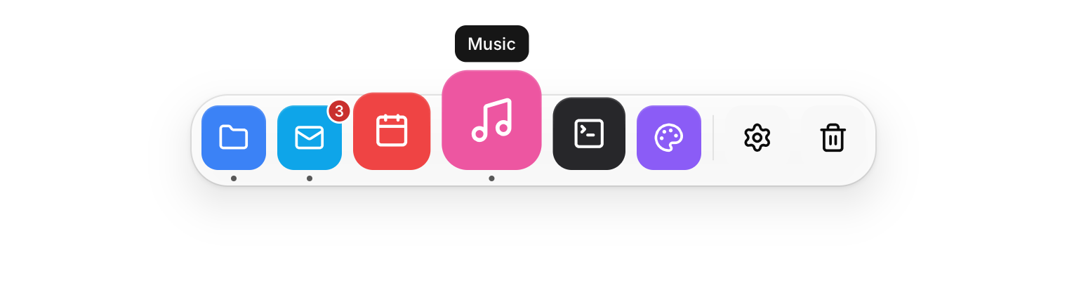
A row of icons that grow under the pointer, as in a desktop dock.
Functions: cui_dock, cui_dock_item, cui_dock_separator
Usage
cui_dock(ui, "dock") {
    if (cui_dock_item(ui, CUI_ICON_FOLDER, "Files", .color = CUI_RGB(0x3b82f6), .running = true)) open_files();
    cui_dock_item(ui, CUI_ICON_MAIL, "Mail", .color = CUI_RGB(0x0ea5e9), .badge = 3);
    cui_dock_separator(ui);
    cui_dock_item(ui, CUI_ICON_TRASH_2, "Trash");
}
Icons grow as the pointer passes, with the item under it largest and its neighbours following on a cosine falloff. Items show their label as a tooltip, a dot when running and a count with badge. Tab and Enter work as well.
cui_dock_item returns true on the frame the item is clicked. Nothing is stored for you: which apps are running is your state, passed in on every frame. The second argument is the tooltip, and NULL leaves it out. badge is a count: 0 shows none and anything over 99 shows "99+". Dock options: size, the icon size at rest in points (46), and magnify, how much the icon under the pointer grows (1.55). The dock centers itself in its container, and in a narrow window the icons shrink and stop growing.
Keyboard
- Tab and Enter work as well.
- Tab moves through the items, and Enter or Space clicks the focused one.
Options of cui_dock
| Option | Type | Default | Description |
|---|---|---|---|
.size | float | Size in points; 0 uses the component's own. | |
.magnify | float | 1.55 | how much the icon under the pointer grows, default 1.55 |
Options of cui_dock_item
| Option | Type | Default | Description |
|---|---|---|---|
.color | cui_color | A theme color such as CUI_COLOR_ACCENT, or CUI_RGB(0x7747ff); unset uses the theme's. | |
.running | bool | a small dot under the icon | |
.badge | int | a count badge on the icon ("99+" above 99); 0 for none |
Related
- Control tiles: Large toggle tiles for quick settings such as Wi-Fi or Do not disturb.
- Loaders: Animated indicators for work in progress, in five styles.
- Now playing, waveform and tab bar: A media player card, an audio waveform to scrub through, and a bottom tab bar for phone layouts.
- Gradient text and spotlight cards: Text filled with a gradient, and a card with a glow that follows the pointer.