Components / Motion
Control tiles
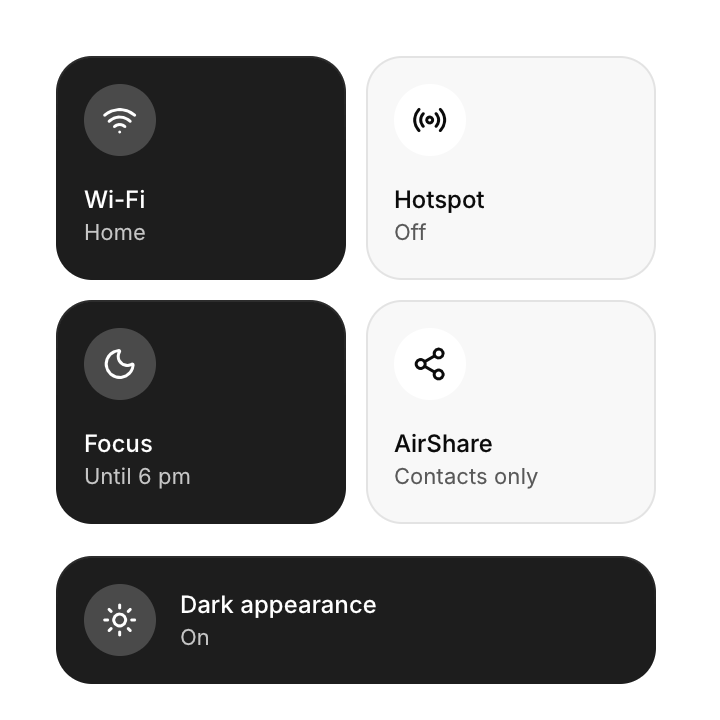
Large toggle tiles for quick settings such as Wi-Fi or Do not disturb.
Functions: cui_box, cui_control_tile
Usage
static bool wifi = true;
cui_control_tile(ui, "Wi-Fi", &wifi, .icon = CUI_ICON_WIFI, .detail = wifi ? "Home" : "Off");
cui_control_tile(ui, "Focus", &focus, .icon = CUI_ICON_MOON, .color = CUI_RGB(0x6366f1));
cui_control_tile(ui, "Dark appearance", &dark, .icon = CUI_ICON_SUN, .wide = true);
Big toggles for quick settings, which fill their grid cell. They switch with a click or with Space and Enter. detail replaces the default On and Off line.
Returns true on the frame the tile is toggled. The second argument points at your bool, which the tile flips; with NULL the tile stays off. The label is also the tile's identity, so two tiles with the same label in one scope need a key: "Wi-Fi##guest" shows "Wi-Fi". A tile fills the width it is given unless width is set, so size tiles with a grid such as cui_box(ui, .dir = CUI_GRID, .columns = 2, .gap = 10). It is at least 112 points tall, or 64 with wide.
Keyboard
- They switch with a click or with Space and Enter.
- Tab focuses a tile, and Enter or Space toggles it.
Options of cui_control_tile
| Option | Type | Default | Description |
|---|---|---|---|
.icon | const char * | An icon: a CUI_ICON_* constant, or a string from another icon font. | |
.detail | const char * | "On" or "Off" | the state line under the label, default "On" or "Off" |
.color | cui_color | A theme color such as CUI_COLOR_ACCENT, or CUI_RGB(0x7747ff); unset uses the theme's. | |
.width | cui_size | Width: CUI_FILL, CUI_FIT, CUI_PX(n) or CUI_PCT(n); unset uses the component's own. | |
.wide | bool | icon beside the text in a lower tile, instead of above it |
Related
- Now playing, waveform and tab bar: A media player card, an audio waveform to scrub through, and a bottom tab bar for phone layouts.
- Dock: A row of icons that grow under the pointer, as in a desktop dock.
- Loaders: Animated indicators for work in progress, in five styles.
- Gradient text and spotlight cards: Text filled with a gradient, and a card with a glow that follows the pointer.