Components / Pickers
Date range picker
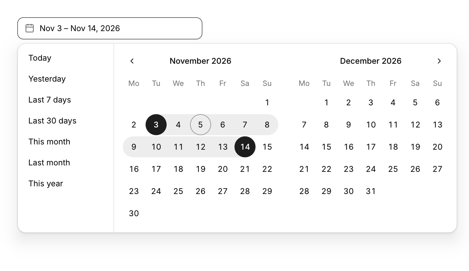
Picks a start and an end date, with presets such as the last 7 days.
Functions: cui_date_range_picker, cui_range_calendar
Usage
static cui_date_range trip;
cui_date_range_picker(ui, "trip", &trip, .label = "Dates");
cui_range_calendar(ui, "inline", &trip, 2);   /* the calendar on its own, one or two months */
Click a start and an end (in either order); while you choose the end, the band follows the pointer. Presets (today, last 7 days, this month...) sit on the left unless .no_presets = true. cui_date_to_days and cui_date_from_days convert dates to day numbers for arithmetic.
Keyboard
- Enter or Space on the field opens the two months and Esc closes them. Inside, Tab moves through the presets and the days, and Enter picks the focused day: first the start, then the end.
Options of cui_date_range_picker
| Option | Type | Default | Description |
|---|---|---|---|
.label | const char * | A label shown above or beside the control. | |
.placeholder | const char * | Muted text shown while the field is empty. | |
.width | cui_size | Width: CUI_FILL, CUI_FIT, CUI_PX(n) or CUI_PCT(n); unset uses the component's own. | |
.no_presets | bool | hides the list of preset ranges beside (or above) the calendar |
cui_date_range
| Field | Type | Description |
|---|---|---|
start | cui_date | first day of the range; a zero date means nothing is chosen |
end | cui_date | last day of the range, inclusive |
Related
- Time picker: Picks a time of day from scrolling columns of hours and minutes.
- Multi-select: Picks several items from a list and shows them as chips in the field.
- Wheel picker and time dial: Touch-style pickers: drums of options you spin, and a clock face for setting a time.
- Color picker: A swatch that opens a saturation and brightness square, a hue bar and preset swatches.