Components / Basics
Badge, avatar and keycap
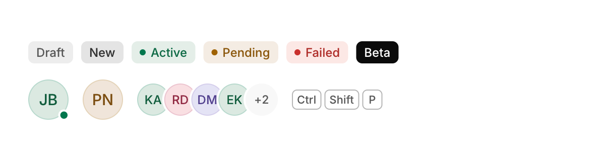
Small labels: a badge for a status or a count, an avatar for a person, and a keycap for a keyboard key.
Functions: cui_avatar, cui_avatar_group, cui_badge, cui_kbd
Usage
cui_badge(ui, "Active", .tone = CUI_TONE_SUCCESS, .dot = true);
cui_badge(ui, "New", .tone = CUI_TONE_INFO, .solid = true);
cui_avatar(ui, "Jonas Berg", .size = 40, .status = "online");   /* online, away, busy, offline */
cui_avatar(ui, "Maya", .image = texture);
cui_avatar_group(ui, names, count, 4, 32);
cui_kbd(ui, "Ctrl Shift P");
Avatars without an image show initials on a color picked from the name, so the same person always gets the same color.
None of these returns anything, keeps state or reacts to the pointer, so a tooltip or a hover card cannot hang from one directly. Badge options: tone (any CUI_TONE_*, neutral when not set), dot, solid, icon and size. cui_avatar takes the person's name, which gives the initials and the color. Options: size, the diameter in points (32), image, a cui_texture that replaces the initials, status and square. status is "online", "busy" or "away", and any other word gives a gray dot. cui_avatar_group takes an array of names, how many there are, how many to show before a "+N" (4 when 0) and the size (32 when 0). cui_kbd takes key names separated by spaces and draws one keycap for each.
Options of cui_avatar
| Option | Type | Default | Description |
|---|---|---|---|
.size | float | Size in points; 0 uses the component's own. | |
.image | cui_texture | picture to show instead of the initials of the name | |
.status | const char * | a dot at the bottom right: "online" green, "busy" red, "away" amber, anything else gray | |
.square | bool | rounded square instead of a circle |
Options of cui_badge
| Option | Type | Default | Description |
|---|---|---|---|
.tone | cui_tone | One of CUI_TONE_NEUTRAL, CUI_TONE_INFO, CUI_TONE_SUCCESS, CUI_TONE_WARNING, CUI_TONE_DANGER, CUI_TONE_VIOLET, CUI_TONE_TEAL, CUI_TONE_ROSE or CUI_TONE_ACCENT. | |
.dot | bool | a small dot before the text, in the tone's color | |
.solid | bool | filled with the tone's color instead of a light tint of it | |
.icon | const char * | An icon: a CUI_ICON_* constant, or a string from another icon font. | |
.size | cui_control_size | One of CUI_SIZE_MD, CUI_SIZE_SM or CUI_SIZE_LG. |
Related
- Hover card: A preview card that opens when the pointer rests on a link, a button or another component that reacts to the pointer.
- Card and metric: A card is a surface that groups content. A metric shows one number with its change and an optional sparkline.
- Icons: The Lucide icon set embedded as a font, used by name through CUI_ICON_* constants.
- Image: Shows a picture loaded from a file or made from your own pixels.