Components / Basics
Card and metric
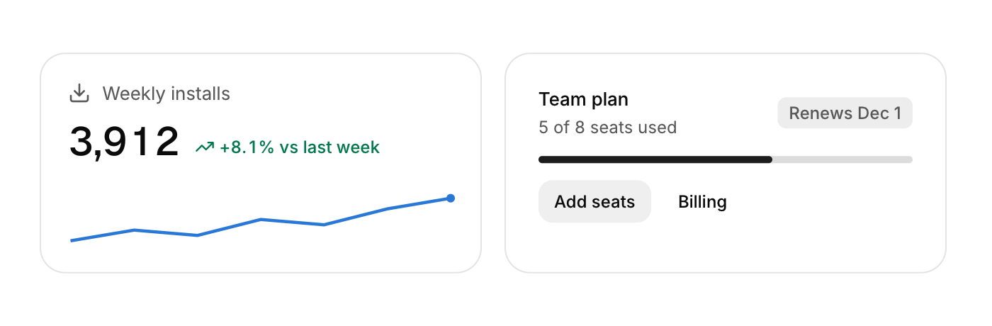
A card is a surface that groups content. A metric shows one number with its change and an optional sparkline.
Functions: cui_card, cui_metric
Usage
cui_card(ui, .gap = 12) { ... }
if (cui_card(ui, .id = "project", .hoverable = true)) { ... }   /* lifts on hover, returns clicks */
cui_metric(ui, "Weekly installs", "3,912", .delta = 8.1f, .spark = values, .spark_count = 7, .icon = CUI_ICON_DOWNLOAD);
cui_metric(ui, "Median build", "3m 42s", .delta = -17.6f, .lower_is_better = true);   /* a fall, in green */
The arrow follows the sign of delta; the color says whether that is good. Set lower_is_better for times, errors and costs.
Cards rest on a hairline border with no shadow. Card options: pad (24), pad_x, pad_y, gap, dir, align, width, height, min_width, max_width, wrap (row cards), hoverable, muted, selected. .width = CUI_FILL, .max_width = 520 fills a phone and stops at 520 on a wide window.
Keyboard
- A
hoverablecard takes Tab, and Enter or Space clicks it. Other cards and metrics only display.
Options of cui_card
| Option | Type | Default | Description |
|---|---|---|---|
.id | const char * | an automatic id | identity of the card, for its hover state (defaults to an automatic id) |
.width | cui_size | Width: CUI_FILL, CUI_FIT, CUI_PX(n) or CUI_PCT(n); unset uses the component's own. | |
.height | cui_size | Height: CUI_FILL, CUI_FIT, CUI_PX(n) or CUI_PCT(n); unset uses the component's own. | |
.min_width | float | e.g. CUI_FILL up to max_width: fills narrow screens, stops on wide ones | |
.max_width | float | e.g. CUI_FILL up to max_width: fills narrow screens, stops on wide ones | |
.pad | float | Padding inside, in points. | |
.pad_x | float | left and right padding in points; 0 uses pad | |
.pad_y | float | top and bottom padding in points; 0 uses pad | |
.gap | float | Space between the items, in points. | |
.dir | cui_dir | One of CUI_COLUMN, CUI_ROW, CUI_STACK or CUI_GRID. | |
.align | cui_align | One of CUI_ALIGN_DEFAULT, CUI_ALIGN_START, CUI_ALIGN_CENTER, CUI_ALIGN_END or CUI_ALIGN_STRETCH. | |
.wrap | bool | CUI_ROW cards: children that do not fit move to a new line | |
.hoverable | bool | lifts slightly on hover and returns clicks | |
.muted | bool | muted surface, no border | |
.selected | bool | accent border |
Options of cui_metric
| Option | Type | Default | Description |
|---|---|---|---|
.delta | float | change shown beside the value with a trend arrow, as a percentage (4.2 shows +4.2%); 0 hides it | |
.delta_label | const char * | text shown instead of the percentage, e.g. "+12 this week"; delta still sets arrow and color | |
.spark | const float * | values for a sparkline under the value; needs at least 2 | |
.spark_count | int | number of values in spark | |
.icon | const char * | An icon: a CUI_ICON_* constant, or a string from another icon font. | |
.width | cui_size | Width: CUI_FILL, CUI_FIT, CUI_PX(n) or CUI_PCT(n); unset uses the component's own. | |
.lower_is_better | bool | build times, errors, latency: a fall is good news, shown in green |
Related
- Image: Shows a picture loaded from a file or made from your own pixels.
- Badge, avatar and keycap: Small labels: a badge for a status or a count, an avatar for a person, and a keycap for a keyboard key.
- Icons: The Lucide icon set embedded as a font, used by name through CUI_ICON_* constants.
- Text: Headings, body text, labels, links and inline code, with wrapping that avoids a lone last word.