Components / Selection
Slider
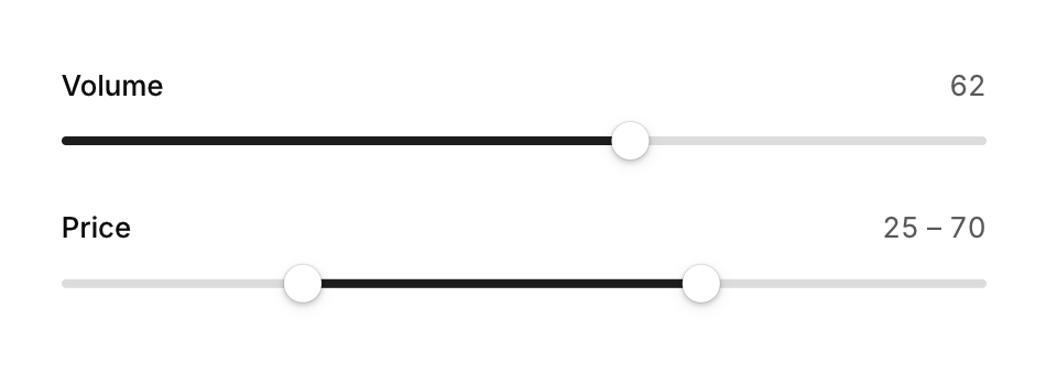
Picks a number, or a range with two thumbs, by dragging along a track.
Functions: cui_range_slider, cui_slider
Usage
cui_slider(ui, "Volume", &volume, 0, 100, .show_value = true);
cui_slider(ui, "Brightness", &brightness, 0, 100, .step = 10, .show_value = true, .format = "%.0f%%");
cui_range_slider(ui, "Price", &lo, &hi, 0, 500);
Drag past either end and the track stretches like rubber, then springs back on release. Clicking the track glides the thumb to the spot. Keyboard: arrows step (Shift for 10 steps), Home and End.
Both return true on a frame the value changes. volume is your float. The slider writes it while it is dragged and keeps it between the minimum and the maximum, so a value set outside the range is pulled back in. format is a printf format for one double and defaults to "%.0f". The label is also the identity: two sliders with the same label in one scope need a key, as in "Volume##left". cui_range_slider takes two floats and no options; its thumbs cannot cross and are moved with the pointer only.
Keyboard
- Arrows step (Shift for 10 steps), Home and End.
Options of cui_slider
| Option | Type | Default | Description |
|---|---|---|---|
.step | float | 0 = continuous | |
.show_value | bool | Shows the value as text. | |
.format | const char * | "%.0f" | printf format for the value, default "%.0f" |
.disabled | bool | Greyed out, and takes no input. | |
.width | cui_size | Width: CUI_FILL, CUI_FIT, CUI_PX(n) or CUI_PCT(n); unset uses the component's own. |
Related
- Chips and rating: A chip is a small toggle for filters and tags. A rating picks a number of stars.
- Checkbox, switch and radio: The three basic choices: a checkbox for an option, a switch for a setting that applies at once, and radio buttons for one of several.
- Radio cards: One choice out of a few, shown as cards with a title and a line of explanation each.
- Segmented control: A compact set of two to five choices where one is always selected, for switching between views of the same content.