Components / Pickers
Date picker and calendar
Picks a date from a month grid, as a field that opens a calendar or as a calendar shown inline.
Functions: cui_calendar, cui_date_picker, cui_date_today
Usage
static cui_date due = { 2026, 11, 14 };
cui_date_picker(ui, "due", &due, .label = "Due date");
cui_calendar(ui, "cal", &due);             /* inline calendar */
cui_date today = cui_date_today();
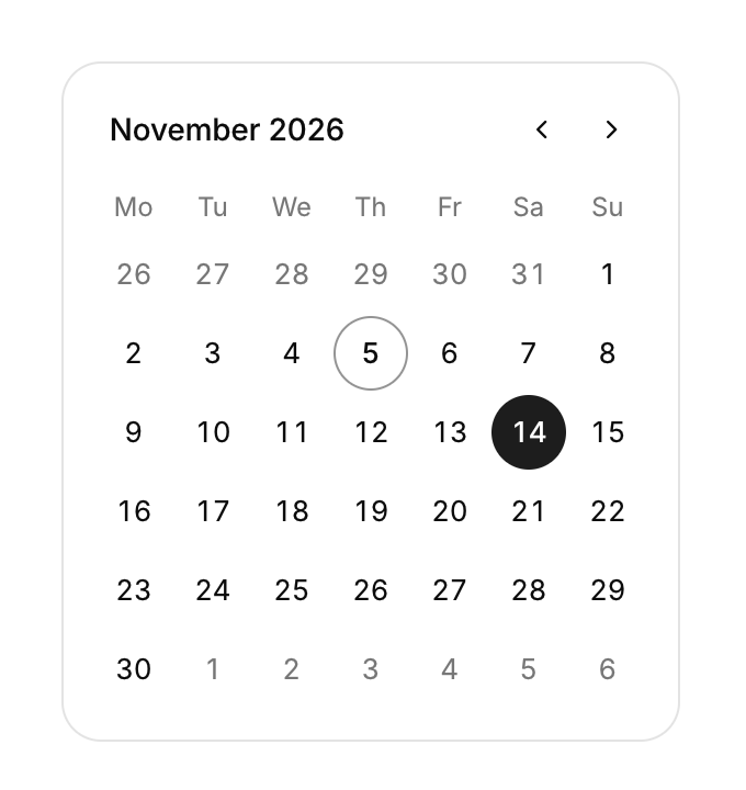
Weeks start on Monday. Today has a ring, the selected day is filled.
Both return true on the frame a day is clicked. due is your cui_date: a year, a month from 1 to 12 and a day. A year of 0 means no date: the picker then shows placeholder, or "Pick a date", and the calendar opens on the current month. The picker writes the date and closes. The library keeps only the month in view, under id. It starts at the month of the value and after that follows the month buttons, so changing the value from code does not turn the page. cui_date_today takes no context and reads the local date from the system clock. For a start and an end, use the date range picker.
Keyboard
- Enter or Space on the field opens the calendar and Esc closes it. Inside, Tab moves through the month buttons and the days, and Enter picks the focused day.
Options of cui_date_picker
| Option | Type | Default | Description |
|---|---|---|---|
.label | const char * | A label shown above or beside the control. | |
.placeholder | const char * | Muted text shown while the field is empty. | |
.width | cui_size | Width: CUI_FILL, CUI_FIT, CUI_PX(n) or CUI_PCT(n); unset uses the component's own. |
Related
- Date range picker: Picks a start and an end date, with presets such as the last 7 days.
- Color picker: A swatch that opens a saturation and brightness square, a hue bar and preset swatches.
- Select and combobox: Picks one item from a list that opens under the field. With search it becomes a combobox.
- Multi-select: Picks several items from a list and shows them as chips in the field.